UX Design
Not another article about UX/UI best practices
I asked my unbelievably crazy amount of 180 instagram followers (and I kid you not: none of them are my parents!) what they want me to write about next. One of them requested that I write about ‘UX/UI best practices’.
So here I am, writing this to on a Sunday at 10pm to meet my 1 blog post per week goal.
Best practices
There are tons of articles about best UX practices. I wasn’t sure if I should write a post because there’s so many people who have already done the work before me and have good side by side comparisons.
I was wondering how I can tackle this topic with a fresh and unique approach. So I asked AI 🙈 and I’ll add my usual 2 cents to it.
Asking copy.ai to write a blog post for me
Alright, so this is what I put into the AI tool copy.ai.
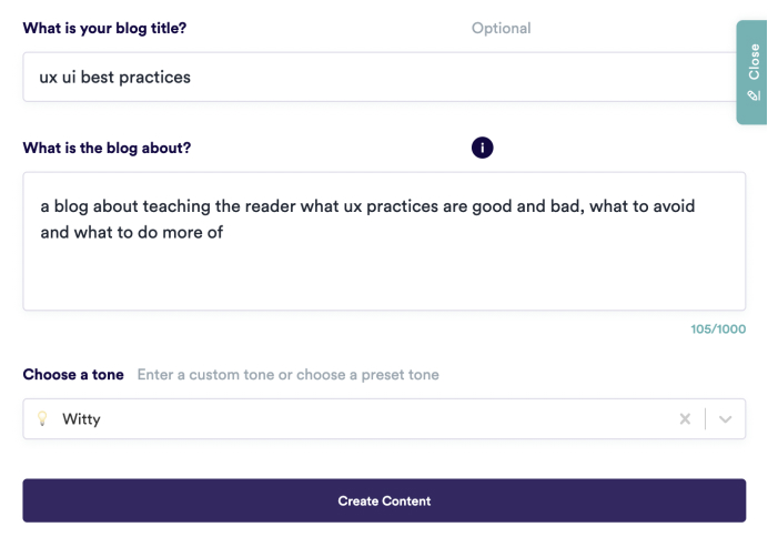
Screenshot of what I asked copy.ai to do
And this is what it spit out:
copy.ai’s output on writing a blog about UX/UI best practices
If you’ve been one of those people that have played with AI or saw some posts, you’ll see how incredibly smart but at the same time, how stupid it is.
Looking at the outline it provided, there are things I agree with and things I don’t, so let’s break it down.
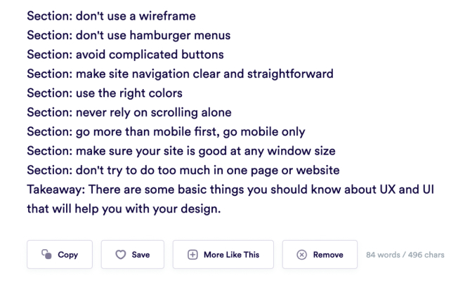
1. Don’t use a wireframe
I’m not sure what it means by that. Any UX/UI design started with a wireframe. It can just be a simple hand-drawn sketch. I would actually say NOT using a wireframe would lead to bad UX/UI practice, because it’ll make it difficult to communicate the idea with a team. Unless you’re the sole designer, you might get away with not wireframing something if you know exactly what it looks like. Personally, I’ve designed so many login screens, I won’t wireframe those anymore. Is not wireframing one of the best UX practices? Probably not.
2. Don’t use hamburger menus
You need some context here. Hamburger menus aren’t a bad thing. It’s only on desktop where I can’t stand them. You have all the real estate to make it easy for the user to see at a glance where in the sitemap they are and where they could go. Just show them the menu and highlight the current page. Why people use hamburger menus on desktop still blows my mind.
On mobile on the other hand, you might not get around using a hamburger menu. Unless it’s a simple app, then a bottom navigation can solve the problem like this example from Material Design.
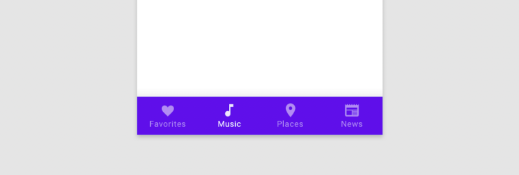
Material Design bottom navigation
Yes, in some cases the easiest way for the user to navigate can be something as simple as breadcrumbs. It’s probably also common knowledge that if you click on the logo you can go back to the home page. But if you have more than 5 pages, you’ll need to use a hamburger menu.
3. Avoid complicated buttons
Well done AI! 👏 I agree with that. But to implement this we need to know what a ‘complicated’ button is and how to avoid them. So here’s 3 very basic requirements for a good button:
Clear design
A button needs to be clearly designed as a button. Ideally, all elements the user can interact with, need to be in the same colour. Rounded cornered buttons seem to work better than edged buttons. But go with what works for your brand. Square buttons for a brand like Disney would look wrong, the same way rounded buttons feel wrong for a brand like Lloyds bank.
Don’t underestimate the power of copy
Another important thing is the label of the button. The power of good copy in general is often underestimated. And buttons need specifically clear copy, so that the user knows exactly what will happen when they click the button. For example, if you look at an online form with the main CTA (=Call to action) “Submit”, you could fill in anything; but “Login” or “Pay now” clearly shows the user know what type of form they’re populating and what will happen after they press that button.
Hierarchy
Button hierarchy is another thing I see especially new designers get wrong. It’s not just about one button but how it’s positioned within the rest of the page. Sometimes there’s several actions, so you don’t just have one main CTA. In this case, it’s important that the main task you want the user to take is the most prominent. But make sure it also works with all the other elements on the page.
4. Make site navigation clear and straightforward
The AI is contradicting itself when we consider point 2: Don’t use hamburger menus. How can it be clear and straight forward if you can’t access it on mobile when you’ve not used a hamburger?
But overall, I agree with this point. Good UX requires the user to be able to navigate on their website. They need to know where they’re currently at and how to get to where they want to go. This can be pretty straight forward.
But it can also become very complex when you look at websites with tons of pages, for example e-commerce. Any fashion brand will need to decide how it structures the navigation. Do we show both male and female clothes when people click on ‘T-shirts’? Do we split items as ‘Tops’ and ‘Bottoms’ or do we go with ‘Active wear’ and ‘Occasion wear’. You get the point, it’s complicated. Those sites definitely need a clear and easy navigation but also a great search functionality.
No matter if it’s complex or not, navigation needs to be clear and straight forward. So yes, I agree with you here AI 👌.
5. Use the right colours
Yes, that’s correct. But what are the ‘right colours’? Coming from a branding background, it has to be the brand colours, of course. But make sure there’s enough contrast, so people can read the text easily. Check the colours against colourblindness and keep accessibility in mind. There’s more people with colour blindness or other accessibility issues than you think that strongly impact your website’s UX. Some people aren’t even aware of it. And the more accessible the design, the better it is for EVERY user. If you make it easier for the person who’d struggle the most to use your site, you’ll automatically make it easier for everyone else.
6. Never rely on scrolling alone
Users are quite used to scrolling on the phone, not so much on desktop. If for example they arrive on a website with a full height hero image, they might not realise they can scroll. Sometimes that’s also the case for mobile. So yes, make sure all relevant information is shown above the fold.
Make sure all relevant information is shown above the fold.
But don’t underestimate the power of scrolling. You can create a very nice experience through storytelling. Just look at the apple website when they release a new product. It doesn’t have to be this fancy. Check out this little page (sneaky little self promotion here, I worked on this with the great team at JKR). Or another nice scrolling effect to highlight certain features of their app.
You have no idea how many times I’ve user tested websites with a full screen hero where people didn’t realise that there’s more to see when they scroll. So always let the next module peak through above the fold.
Yes, you can also add a ‘scroll’ indicator, but personally I feel they’re like a bad joke. If you have to explain the pun, it’s not a good joke, just make it obvious that there’s more below.
7. Go more than mobile first, go mobile only
🤦🏻♀️ Dear AI, you got this wrong. It always depends on what you’re designing. For some reason most of my clients in the last 2 years where desktop first platforms. I have worked on a bunch of data visualisation tools that are used by people who work from an office or at home on a big screen. They need to analyze the data. There might be a responsive version where they could have a look on smaller screens. But because they will look at things on desktop, a mobile first approach will not create the best user experience for them.
The first time I interviewed someone for a Junior UX role
I also remember the first time I was tasked to hire a new designer for the team. It was a junior designer role and we gave them a design task. Yes, I know, I’m not proud of it. The portfolio should do that job. I wouldn’t go to my hair dresser and ask them to cut me some bangs just to showcase if they can actually cut hair. So why do we do this with developers and designers? Scrap that test. But old me didn’t know better.
Anyway, the task was to create a platform for recruiters, where they can manage their candidates. We also asked them to not spend more than 1–2 hours on it. Wireframes are sufficient. So one of the designers started his pitch with “Everything is on mobile nowadays, so of course we’re doing mobile first”. When I asked him if recruiters are more likely to review CVs and cover letters on a mobile phone or desktop device, he instantly realised his mistake. But that’s fine, it was for a junior role, we weren’t expecting all the knowledge. But just before I get off another tangine, the takeaway for this paragraph is to keep in mind not just WHO you’re designing for, but also HOW they’re accessing your platform.
8. Make sure your site is good at any window size
Okay AI, you’re contradicting yourself again. What did you just say at point 7? Make up your mind.
9. Don’t try to do too much in one page or website
Yes, agree with that. Make sure to get rid of all the distractions. Don’t overwhelm the user, give them one bit at a time. Users are more likely to drop off if they feel like there’s too much work required to get to where they want to be. Have a look at the Contra onboarding below when you want to see a good example of how to make something feel simple and easy when you’re asking the user for a lot of information.
Takeaway: There are some basic things you should know about UX and UI that will help you with your design.
Thanks AI. But for best UX/UI practice, just some basic knowledge won’t be enough. You need expertise and experience and ideally, you’ll user test your designs.
Can AI help you with UX best practices?
Looking at the exercise above, I don’t think it can. At least not yet. But I wouldn’t be surprised if in the future websites will be created by AI. And that it’ll automatically A/B test, iterate and improve the site as people are using it.
Just give me some examples
I already hear the voice of the person who requested me to write an article about best practices complaining that I didn’t actually show best practice examples. But as I mentioned before, there are tons of articles. But I have this habit that when I see some nice UX, I take a screenshot or record it. So here are a few bits of UX design that I came across that I’d use as a bench mark for good practice.
Contra sign up
I recently came across this website and loved their onboarding. There is a lot to do when you onboard, but they manage to split it up into small chunks. So you don’t see all fields at once and get overwhelmed. As you type, they show you the results, so there’s an instant reward. Well done!
Why do I think this is a good example? They could’ve overwhelmed you with a long sign up page where you see 15–20 fields at once. Instead, they give you bite sized chunks and you see the result instantly, which adds some sort of gamification and WYSIWYG.
It gives you security, because you see what other people will see as you enter your data. And they made a long sign up process feel quick and easy. Nod to the designers at contra, very well done!
Booking.com flights
I gave booking.com for flights a go out of interest. This image below is just a very simple screenshot for the flight booking confirmation, but I loved it. It’s not a crazy concept, just a normal confirmation screen, image with text.
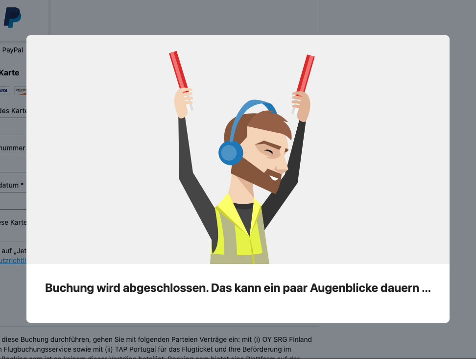
Flight booking confirmation screen on booking.com
What’s good practice about it? Showing a confirmation screen after the user has finished the task they came to the website for is great, especially when there’s payment or a booking involved.
Let the user know that what they came to your site to do was accomplished. What makes it great? Just look at the illustration of this very happy dude who is just as excited as you that you’re going on a flight. The image makes you look forward to the trip and makes you feel like you’re in safe hands and will receive a great customer service.
Calendly
The first time I used calendly I was so pleased. Before, using a scheduling site could be incredibly daunting. There were sites which wouldn’t show you at a glance if there was an appointment available at certain dates. You had to click on every single day until, because they didn’t disable the dates that were fully booked. Some have a ‘show me the next available appoitnment feature’ which is very handy when it comes to booking a doctor’s appointment. But even if they have that one feature, it was probably based on a workaround because they couldn’t disable unavailable dates.
Calendly made it super simple. They don’t overwhelm you but guide the user step by step through the process.
- 1. What type of appointment do you want?
- 2. What date?
- 3. What time
And all of that is happening on one page. And once you’ve selected everything, it looks like this
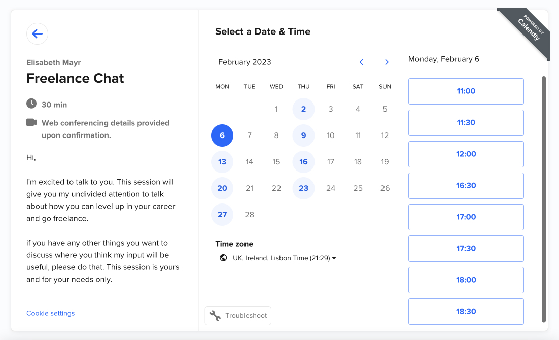
Calendly screenshot
This actually looks a bit overwhelming. But because they started with the appointment and added on the other elements later, the user had time to digest it.
This is actually a screenshot from my own calendly profile. If you’ve not booked via calendly before, feel free to click on my booking link to try it out. If you’re interested in freelancing, you can also book a call directly with me. The reason I’m doing this is because for me personally, going freelance has changed my life in such a postivie way and I want other people to be able to do the same. So if you’re interested in freelancing, feel free to not just check out the form but actually book an appointment with me.
Alright, here you are you one of the 2 followers that replied to my question. I’m still baffled that I get replies at all, so I really appreciate it.
The next request was: How to charge clients. So if you want to read that one, give me a follow on medium to be notified when it goes life. You can also sign up to my newsletter to learn more about all things freelance, digital nomading and UX.