BrightSites
About BrightSites
Brightsites is a company that provides several software products for their publishing clients. After working on Brightsites' FLOW CMS product (case study coming soon), I got the opportunity to redesign their website.
The Goal
The goal of the website was to make it look more modern and in line with the redesign of the existing products, while maintaining the Brightsites Logo. They wanted to introduce their product solutions and inform potential clients about their services.
One of their aims was to make the website feel friendly but professional. They didn't want to come across as a big commercial software provider, while still making it clear that their products are fit for commercial audiences.
The Challenge
The client didn't have much time, so I had to churn out the designs in a handful of days. I would have liked to spend more time on the project but sometimes you just have to do your best with the limited time available.

Previous design of the Brightsites website
Before
This is what the website used to look like in January 2021.
The website was a one pager which was not ideal for SEO. Clicking on the CTAs scrolled the user to another section of the page.

Site map
To improve SEO and to give each Brightsites product the space it deserved, it was clear that the page can no longer be a one pager. Together with the project manager we decided on what pages were needed. Other than the emphasis on introducing their range of products, they wanted to focus on a documentation section to help their existing user base and potential new customers to date with the latest releases.
Another important section was to show case how their products have helped their existing clients, so we added a case study page. Once it was decided what pages were needed, I have put together a sitemap.
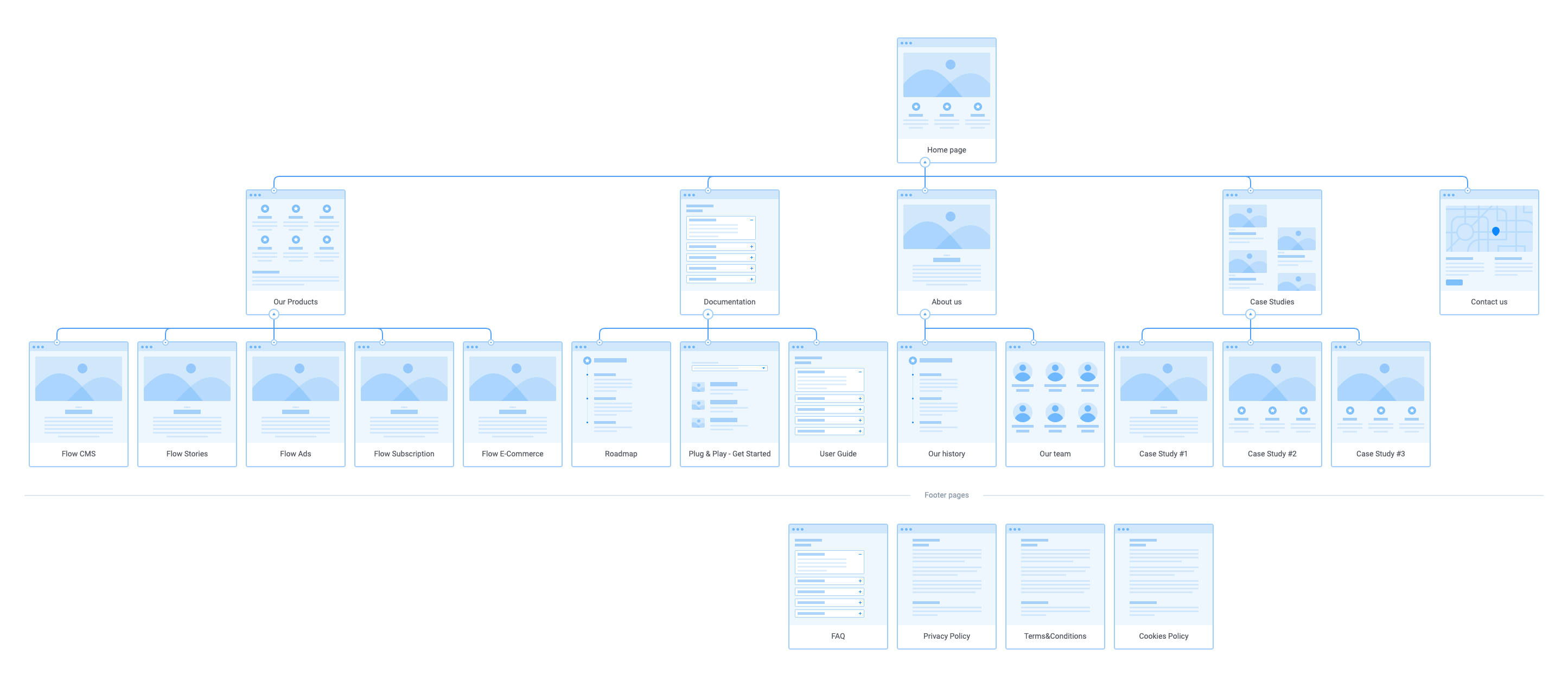
Suggested Sitemap
Wireframes
Once we decided on what content to show on each page, I designed the wireframes. You can find some examples below.
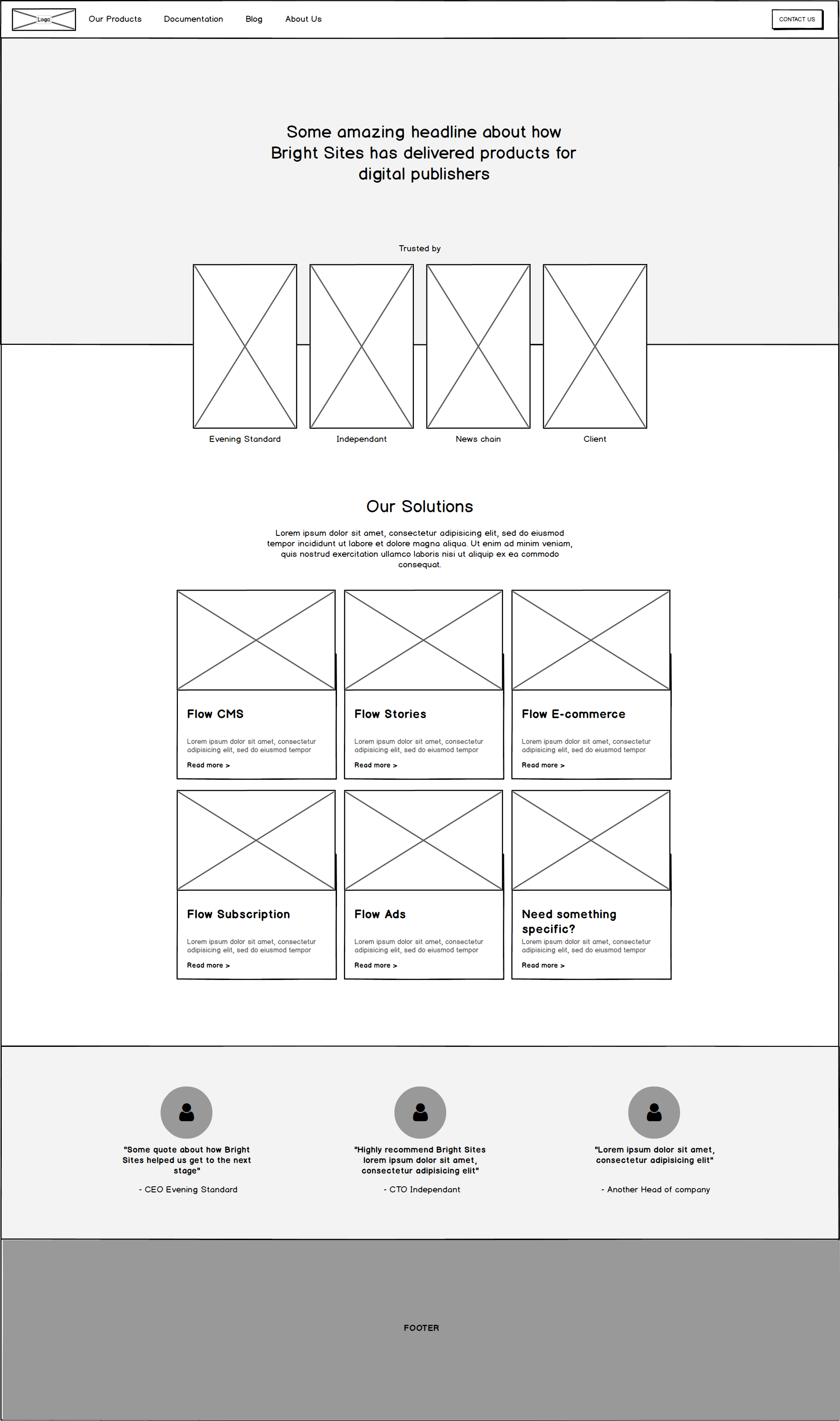
Homepage Wireframe Version 1
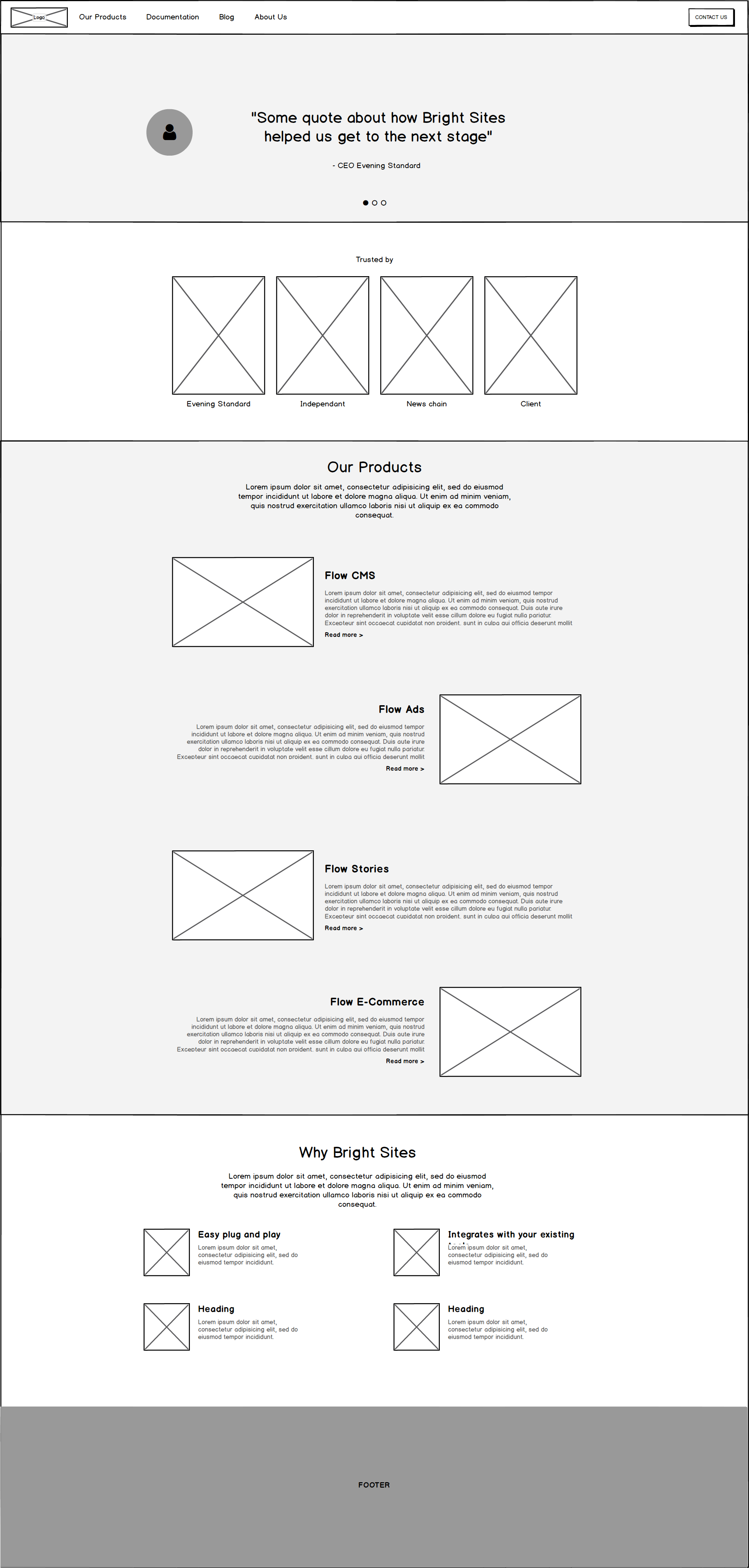
Homepage Wireframe Version 2
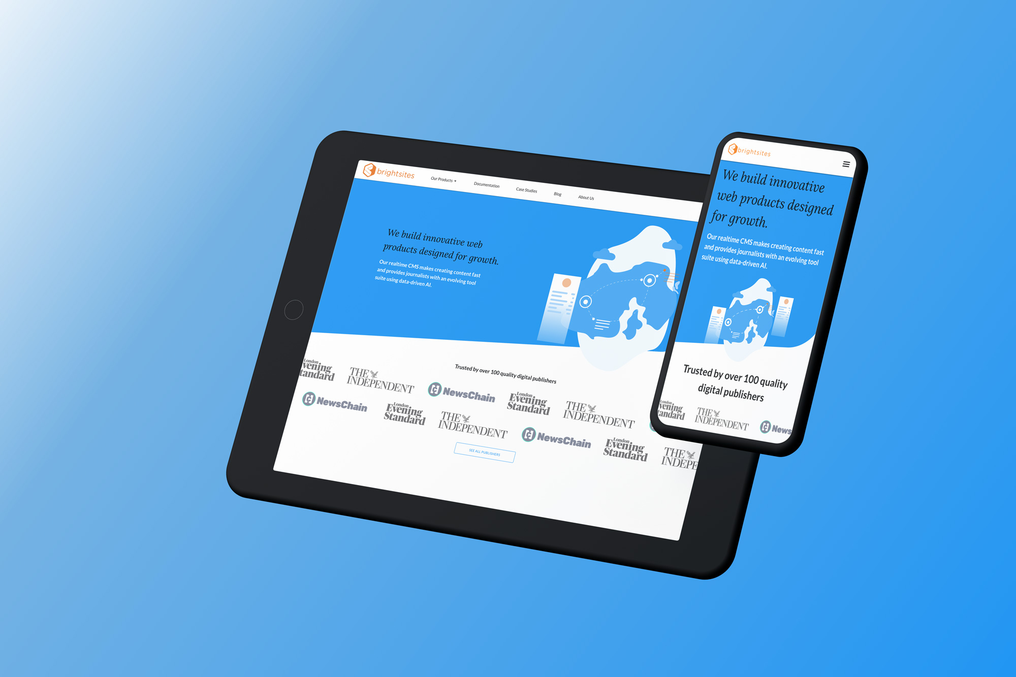
Rebranding
The client wanted to change the prominent orange on their page and to have a very different look and feel. Unfortunately, there wasn't much time to come up with a complete new branding, so i rushed it by simply picking the colours they use for their product solutions.
The only thing that the client wanted to keep was the logo. They wanted the rest of the website to feel more friendly and less commercial.
I added some rounded corners to emphasise on the friendly feel and therefore making it a bit less commercial. I also found an illustration library which the client felt matched their brand and adjusted the colour scheme and combined elements to create new graphics for the website.
New Brightsites website
Learnings
This project was done in a very short amount of time. I wish I had more time to work on the brand instead of picking an illustration library, however, considering the short amount of time, I think the new design is still an improvement to the original website.
Update
The client didn't have the time to implement the website as planned, so it ended up being a one pager for now. You can view the current site here.