Sketcha
About this Software
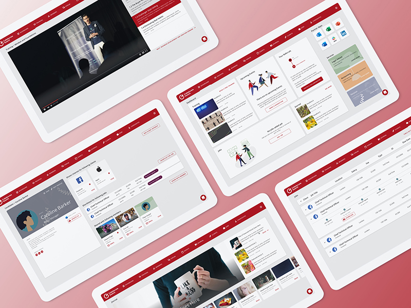
Apex MobileTech already offers several floor plan drawing solutions. They wanted to create a floor plan application which is easy to use on a tablet and won’t require much training and most importantly, will be much easier to use compared to their existing softwares.
Goal
The average floor plan tool requires a lot of tools and mode changes. One mode to build walls, a tool for drawing a wall, another tool to delete the wall, a separate mode to add furniture, a tool to add a window, a tool to change wall colour... you get the drill.
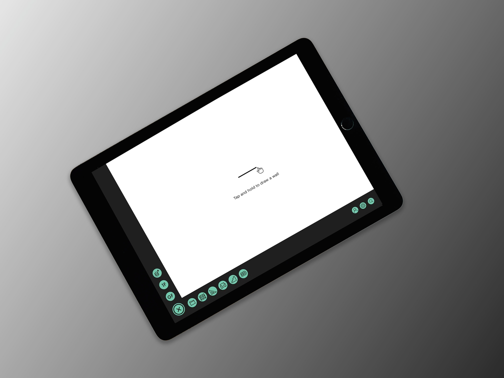
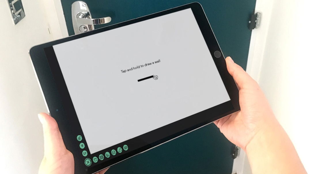
Using this software should be as easy as drawing on paper.
The aim behind this software was to eliminate mode changes and allow the user to just click anywhere and prompt them with the neccessary options. This software had to be different - no swapping between modes, just a very self-explanatory and intuitive design.
Branding
I was told to play around with a logo. The software did not have a name yet, "Sketcher" was just the working title but this had to do to get some look and feel for the brand. We aimed for a modern look. I wanted the logo to represent the basics of floor plan sketching and implemented a divider caliper into the logo.
User Interface
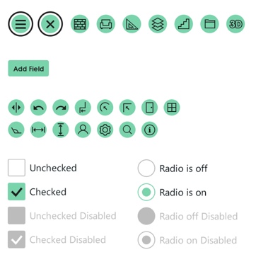
For this project, I created a new UI Kit from scratch. The buttons were purposely large to allow for an easy touch target. The icons needed to be easy to understand as space was limited for additional labels.
Smart Options
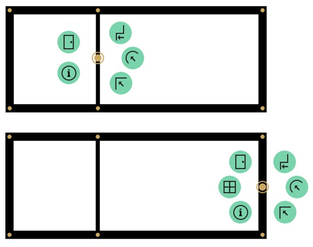
To avoid mode changes, the navigation had to be very smart, so that the user does not have to even think where to find the tools they're looking for by instantly being shown relevant options. When tapping on a clear area of the canvas, the user was only shown options that they might want to do when tapping there, eg. start a new wall.
Based on what element of the floor plan was selected, the relevant options popped up. The ‘add window’ option only appears when the user selects an outdoor wall, but not when they select an indoor wall.
Transitions
Menu
Since the user interface allowed for the buttons to pop up anywhere the user clicks, it needed to be clear where the options popped up. That meant that they couldn't just appear, they needed a clear transition. It also needed to be quick, so that the user doesn't wait too long to see their options.
The dot in the middle marks the point the user tapped on.

Navigation
To give the software a paper-like feel, I wanted the user to be able to use the whole canvas. There still needed to be a way to open up the different tools without cluttering the workspace with too much UI. The menu had to be easily hidden.

Touch Gestures
Since the aim of the project was to reduce tools and mode changes, I looked into different gestures. Before implementing them, I did some research on existing users by showing them a static screen on a tablet and asking them how they’d draw a wall or move a window. The results were very straight-forward so I implemented those in the final designs.
Adding floors
The left hand side of the navigation shows the user what floor they're currently working on. Selecting the plus icon will add a new floor. Floors can be reordered by simply dragging the floor buttons to above and below one another.
Adding stairs will automatically add a floor above the current floor, which is simultaniously added to the navigation, as you can see in the video.
Disclaimer
It was decided not to build this application since the development for the 3D floor plan software was already quite far ahead and met a similar target audience.